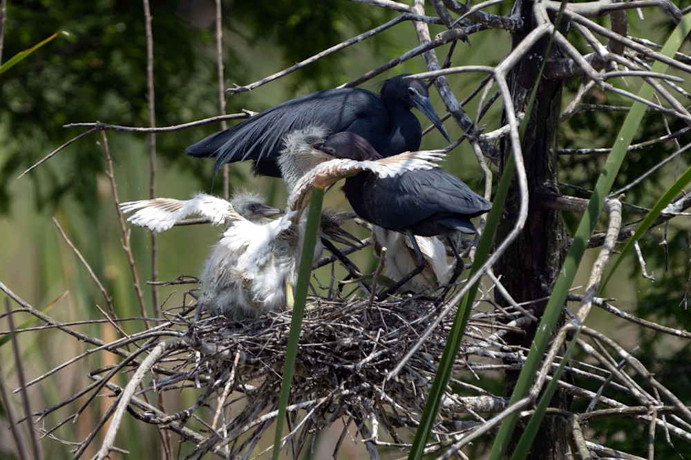
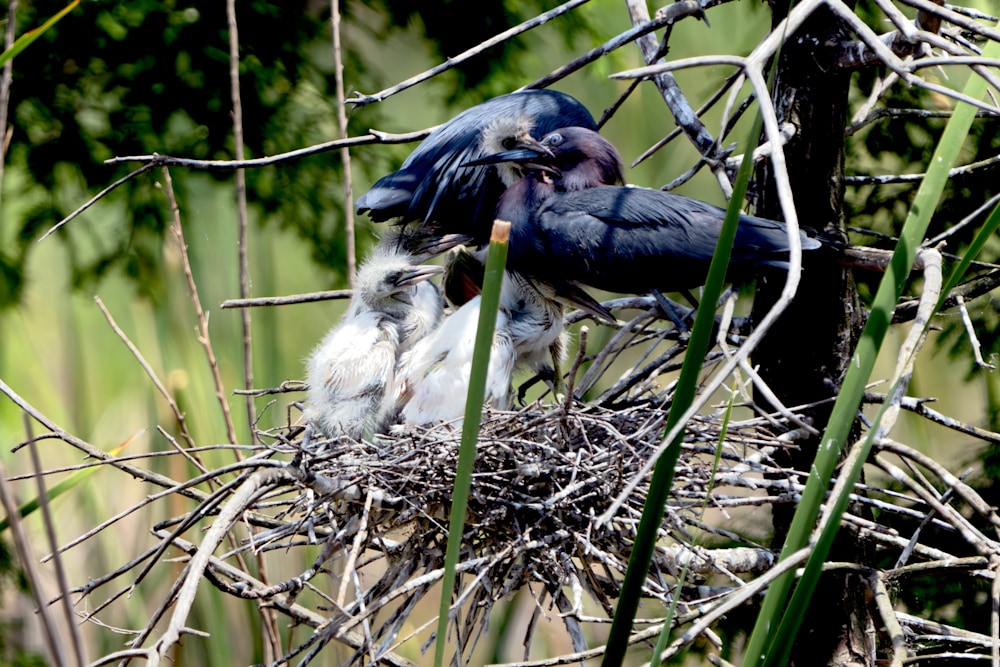
There’s a blue heron rookery in the Ibis pond. There’s also an egret one, but well, these are from the blue herons.
It was feeding time on one nest, and dad was doing the honors.
Every last bit.
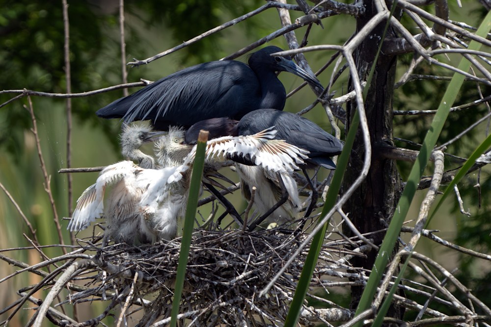
All done:
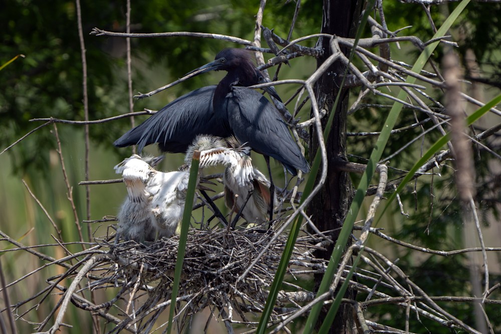 More, Now!
There’s a blue heron rookery in the Ibis pond. There’s also an egret one, but well, these are from the blue herons.
It was feeding time on one nest, and dad was doing the honors.
Every last bit.
All done:
More, Now!
It can take a surprising amount of layers to get an image the way you want. This isn’t necessarily a particularly great image, but I still want to do my best. Going from:
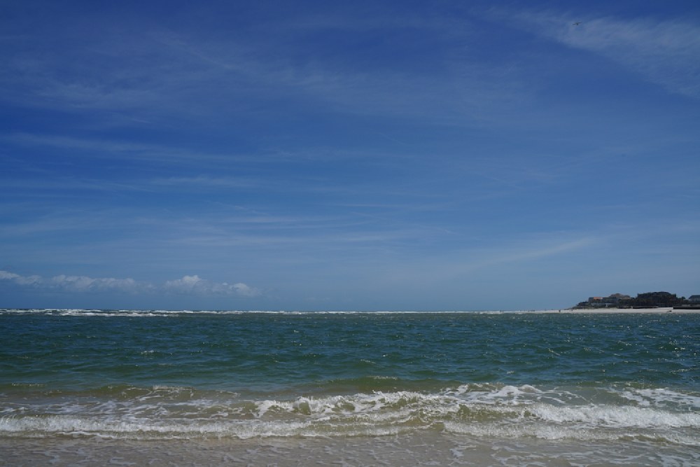
to
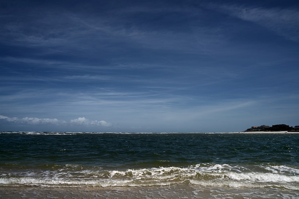 Takes a bit of work.
I divided it into four layers.
The cloulds:
The rest of the sky:
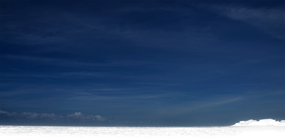 The water:
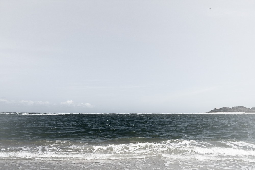
and a background layer to put it all together
I adjusted each layer to get a well blended mixture of the features.
For my work see playfulgallery.com (I changed the name because there are too dangled many Robert Harrisons and my website supports more than one artist.)
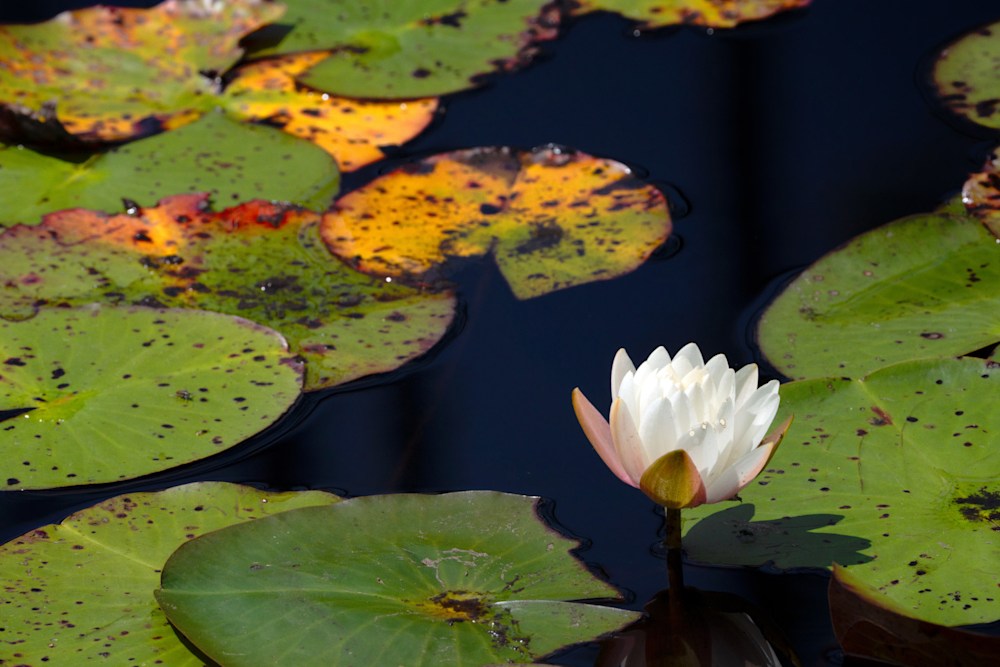
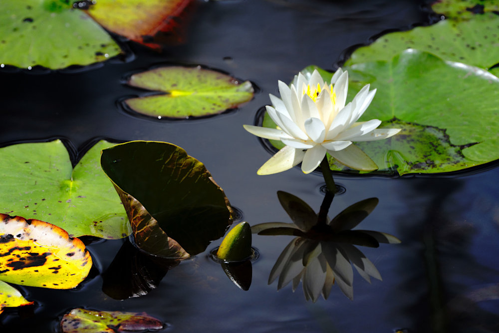
Aurora and I have been exploring the Georgia/Florida border; looking for inspiration. We stopped in the Okefenokee NWR – but with a dog in tow weren’t in a good way to go into the swamp. (You have to canoe and even though Finn is a big dog, he is “munchable” by Gator standards.)
Nonetheless, there are opportunities to see flowers and ‘gators outside of the deep swamp.
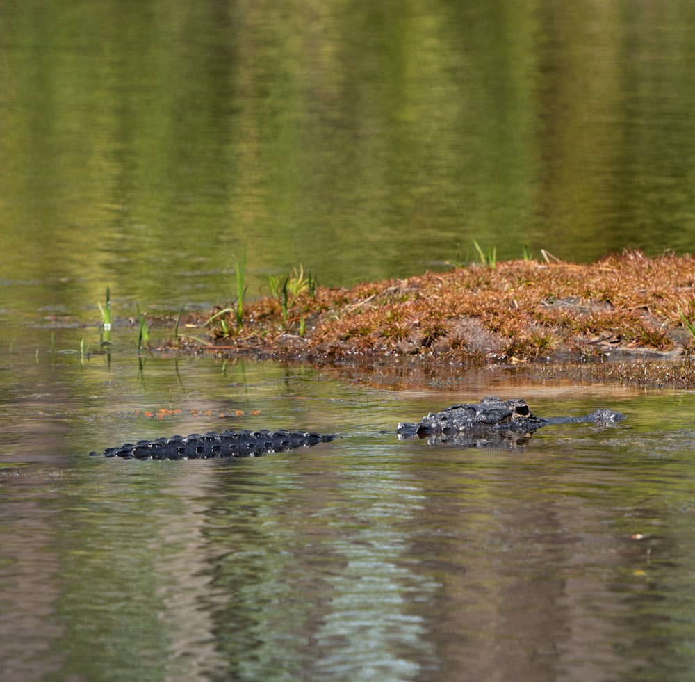
It wouldn’t be the Okefenokee without one of these.
I’m somewhat proud of these photographs. One of my favorite tricks is to use a long lens (600mm) to get the image. You’d think a “normal” lens of 50mm or so would be the way to go, but that will distort the image. Basically, if you get close enough for the flower to be large, then you’re so close that the perspective is warped. And unlike star trek, warping isn’t a good thing, unless you’re doing it for a reason.
I processed the image in photoshop by dividing into layers and adjusting each layer individually. For these images, I used three layers: the flower, the black water, and the rest.
Not bad if I say so myself.
| How I go from a raw image to a photograph in 42 easy steps. There’s a neat trick in photoshop (and gimp) that makes it much easier to adjust photograph intensity and get the image you want. Normally, you would select a color range or a subject, possibly adjust the selection and then use image tools to adjust the image bit by bit to get what you want. This works well when there isn’t much to change, but it’s very hard to backtrack and readjust things because the selection will change after you’ve changed the image. It’s surprisingly easy to go off the deep end and have to start over, again. Here’s an example I just put up on our website. The original is below: |
 |
| It’s a bit flat. Pretty enough, but flat, and grey, and not very interesting. I divided this into four layers: sky, trees, shadow, and rocks (well everything else). Then I could adjust these independently. The sky gets darker, the trees more saturated, the rocks more intense, and the shadow lighter. Suddenly it has a bit of pop. |
 |
| I’m still not sure anyone who isn’t a geologist will really like it, but it is a much improved photograph. (I also had to remove some specks in the sky. I must remember to clean my filters more often.) Here’s another example. This one is St Catherine’s chapel in Abbotsbury UK. The original is bluh and distorted because I’m looking up at it. |
 |
| Three layers are what’s needed: the chapel, the sky, and the ground. I darkened the sky, slightly brightened the building, and adjusted the ground. Photoshop has a perspective warp and I used that to straighten the building. Because of the warp, I had to crop a bit. |
 |
| It’s a much more intense and almost frightening building now. I could probably adjust it a bit more (I wonder if a lighter building would be good), but as it is, I almost expect a spectral friar to gaze malevolently from the tower or perhaps a hapless abbot to rise from his grave at night and pursue the living. Not that any of this will happen. Abbotsbury is a delightful English village and things like that just don’t happen. For more examples please see http://www.robertharrisonfineart.com |
I love this picture of two does facing off.
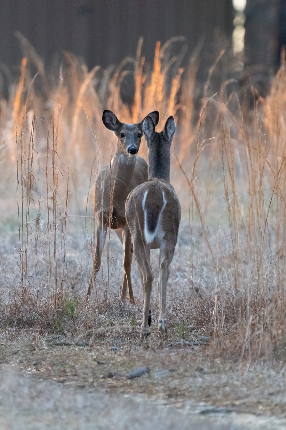
They’re sisters and establishing their relative pecking order.
I took this image at dusk with the sun filtering in from behind them and illuminating the tall grass behind and around the two deer.
One of the pleasures of watching a population of wild animals evolve over time is that you sort of get to know them. We’ve seen these gals with their mother, and brother as they grow from fawns to mature animals. Mom has just decided that it’s time for her girls to strike off on their own. Their brother left last year after being a “spike” buck and we’ve seen him since with a moderate rack. If the hunters don’t get him this year, he’ll be even more handsome next year.
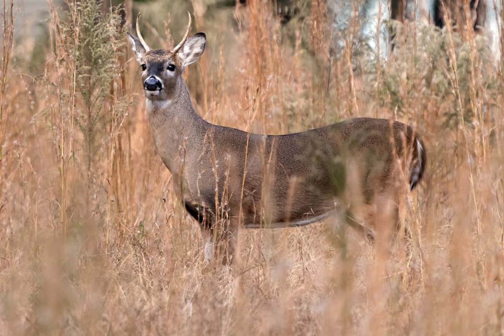
This is him, from earlier in the year.
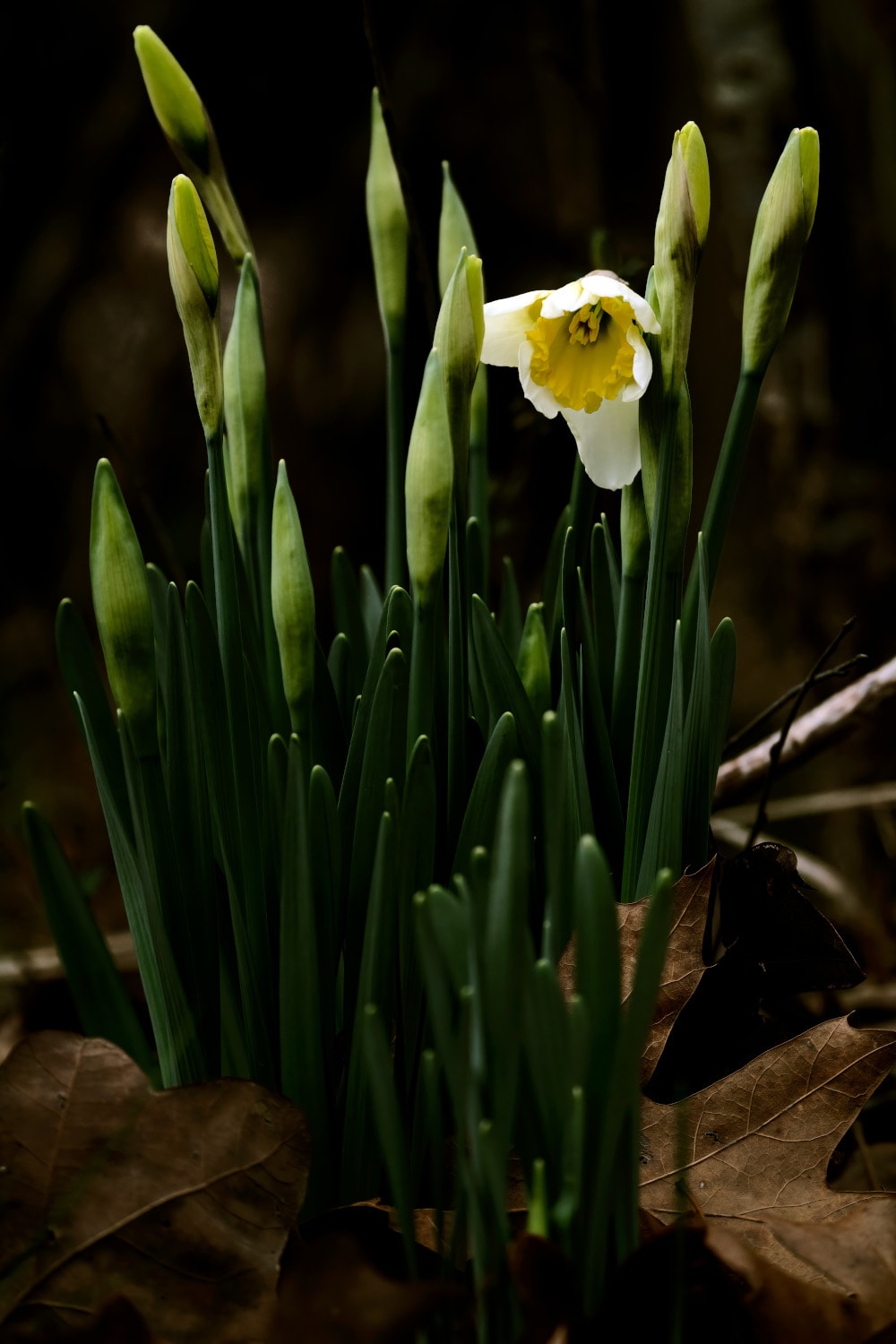
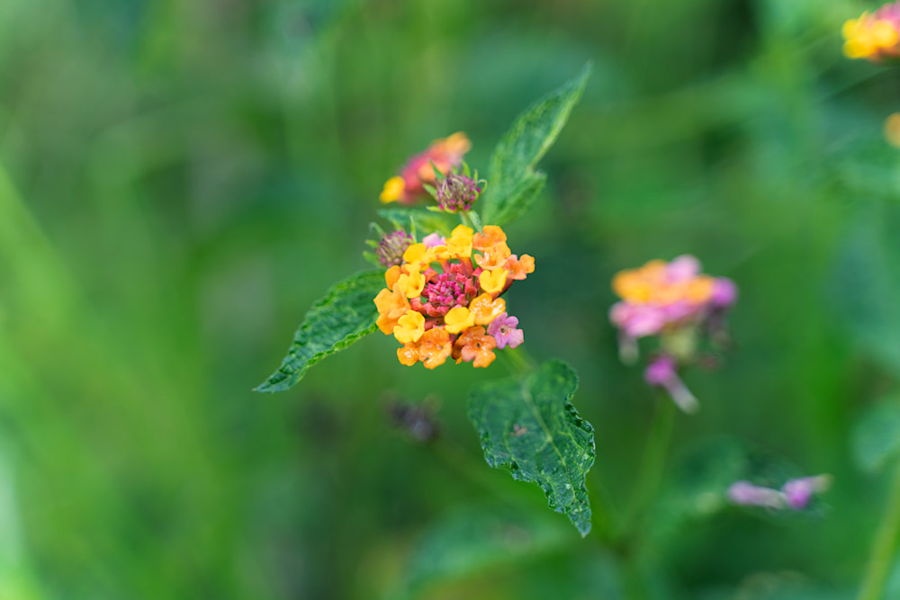
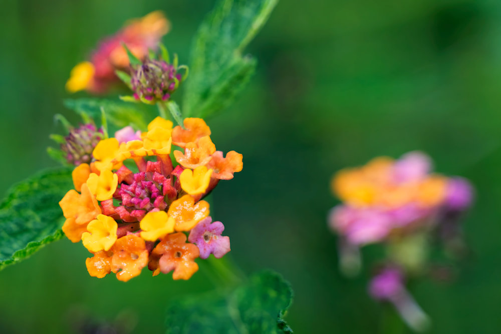
I caught this one flower, the first from its bunch to blossom. The 600mm lens I used let me control the depth of field and I adjusted the saturation and colors to emphasize the bloom and the bunds that were ready to open.
It’s just one of those pretty pictures that one can be philosophical about … or not.
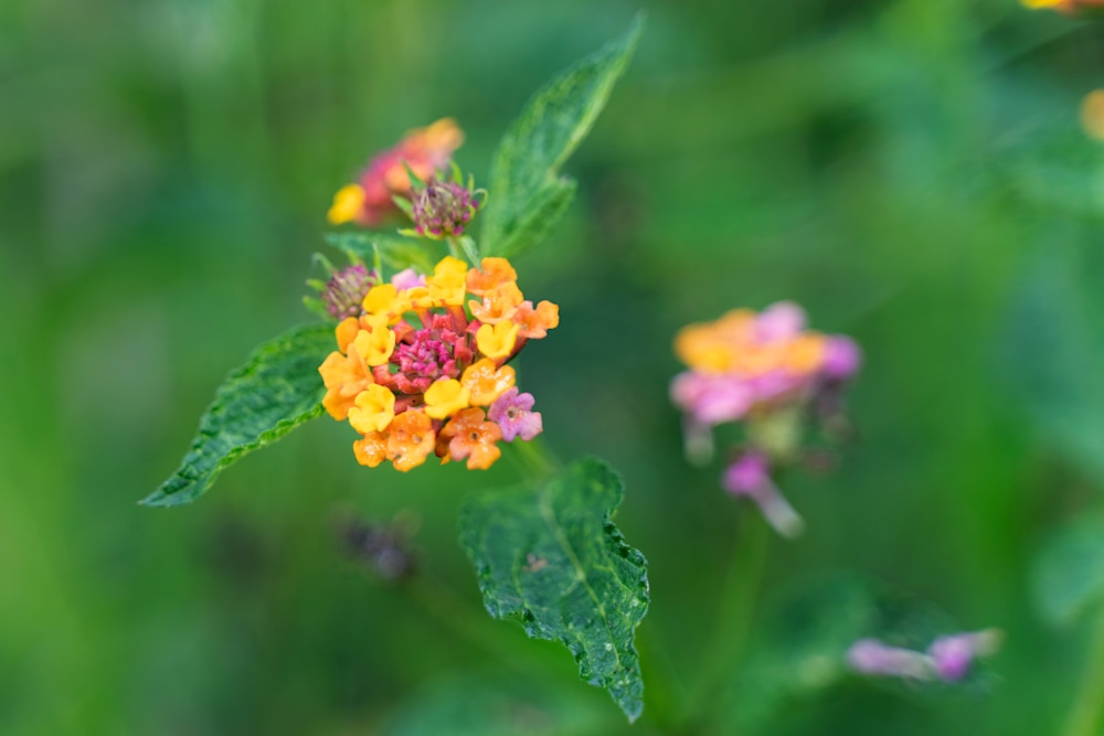
I thought it would be worthwhile to show how a little cropping can make an image. I have rather mixed feelings about cropping as my ideal is to make the image in the viewfinder. It’s not for nothing that I say I admire Henri Cartier-Bresson and his principles.
Principles are nice, but a good image is everything.
The original image, after correcting the color and intensity, is nice enough, but there’s an awful lot of blurry green background. Once you’ve seen one bit of green blur, you’ve seen it all.
A first crop gives:
Which is pretty good, but maybe we can do better. Let’s try a square crop:
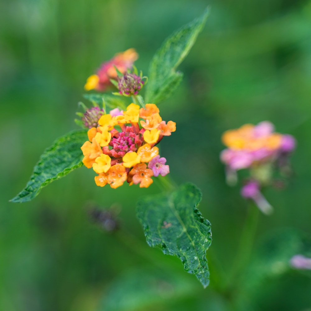
That’s better but let’s see what happens when we get close up:
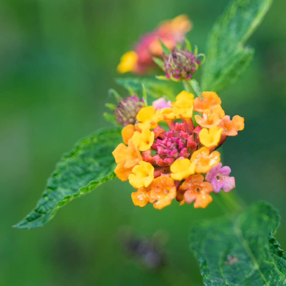
That’s got the main flower right, but something is missing. So we go back to the original aspect ration and stay close in:
And that’s right. It has the detail but the other blooms balance the image. This image is the one on the website.
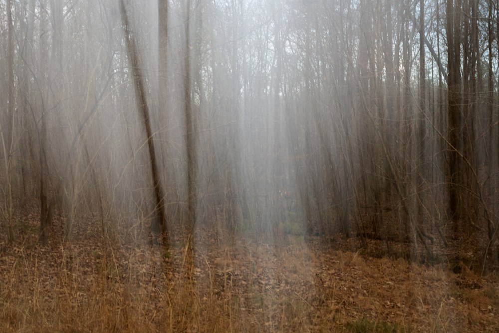
~ Buddhist saying
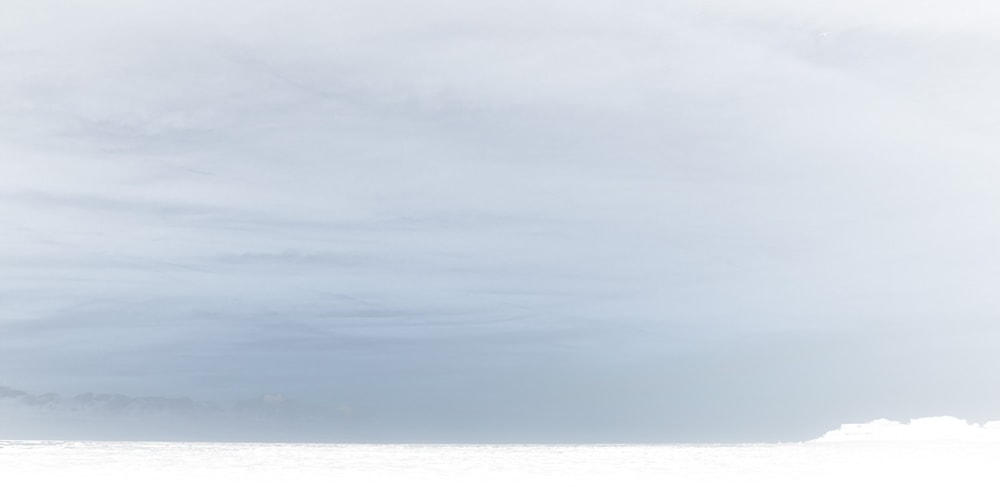
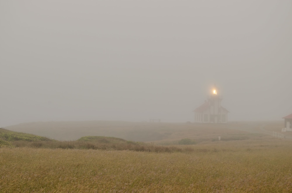
(Cabrillo Point Lighthouse, California in the fog).
~ Lao Tzu
I recently attended a southeastern photography society meeting which was neat. Many of the photographers lamented the demise of polaroid imaging. Apparently, there was quite a sub-culture involved in modifying the process either to put images on unusual papers or to modify SX-70 images while they were still squishy.
I loved the squishy effect and the applied mathematician in my background realized it was a problem in fluid dynamics. Therefore, it was something fun to play with and more importantly I knew how to do it.
Or at least I thought I did. Turning the idea into an algorithm and then an efficient program took a little work. Work which I’ll describe after the photots.
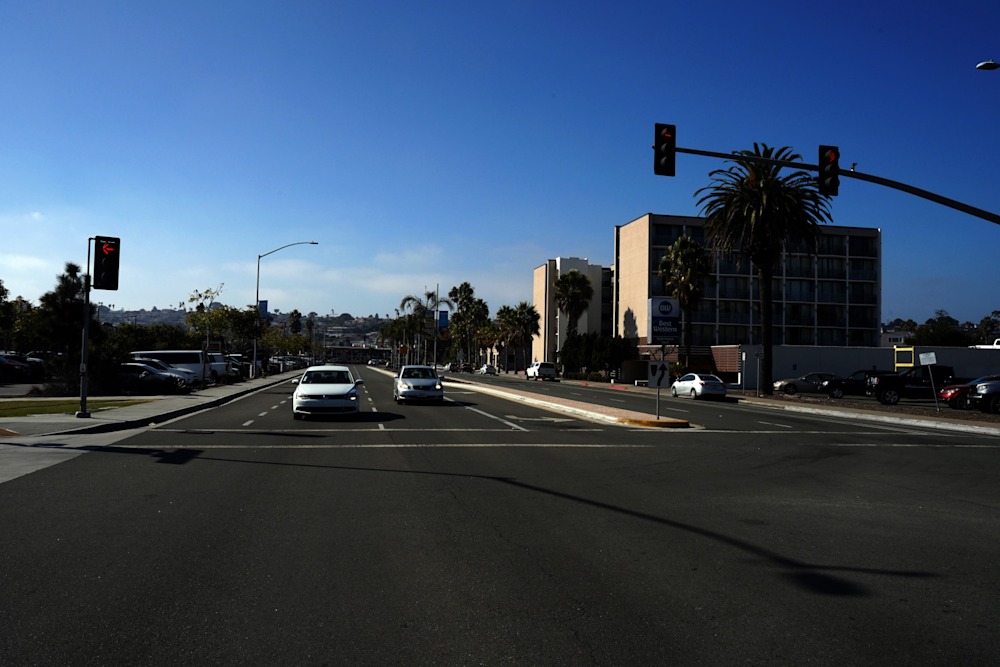
Here’s my test image. Nothing special, really, just a street scene in San Diego from a study section trip.
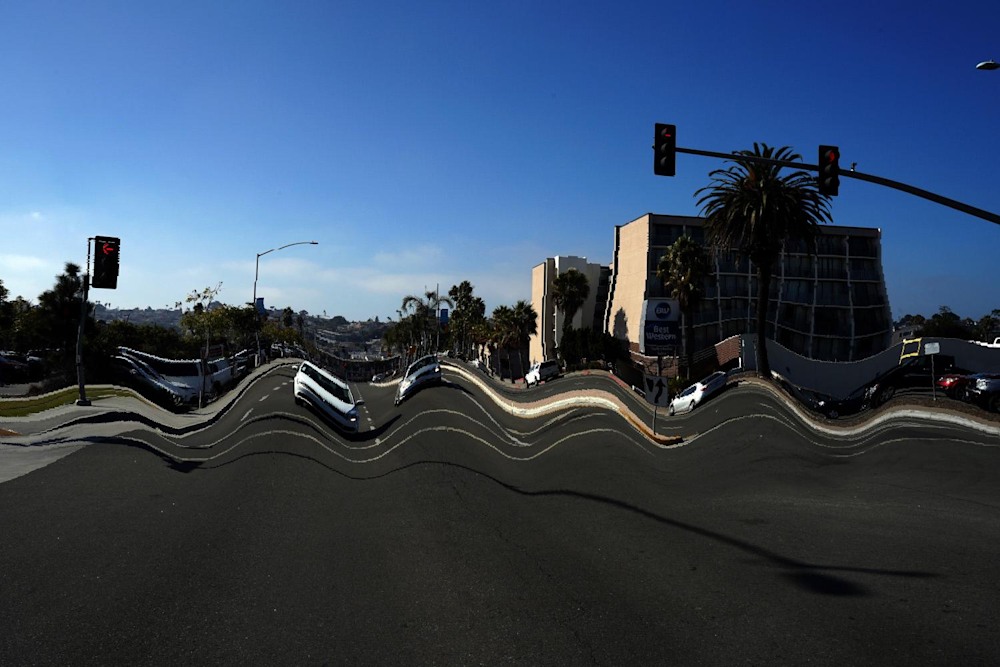
After applying a coordinate deformation, I generate this wavy image. The coordinate deformation is determined by the red and green bits on an input mask:
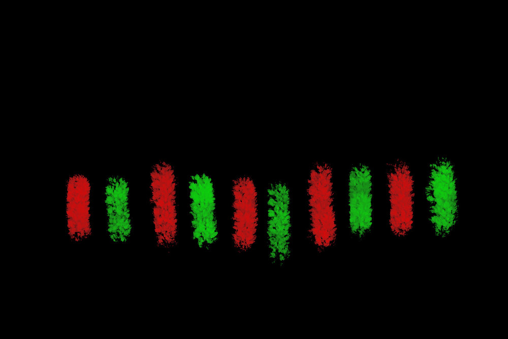
This is designed so you can use a layer in photoshop or Gimp to draw it over the original image. Red is high pressure, where the image moves away, and green is low pressure, where the image moves to. The background can be black, white, or transparent without effect.
Using a different pattern results in a different image:
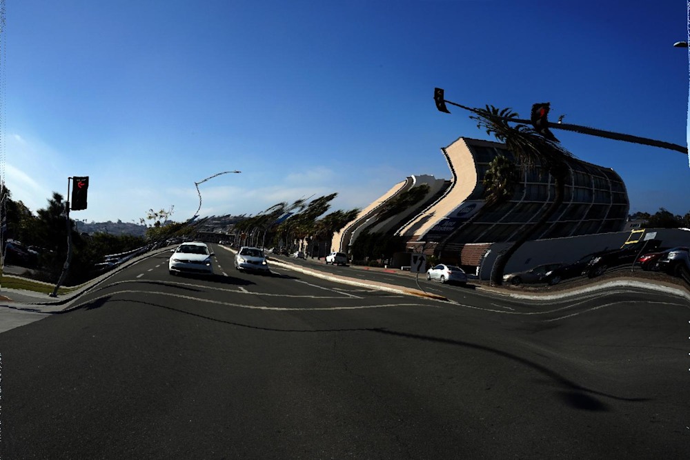
Which is sort of cool.
Outside of efficiency issues and wandering aimlessly down a quick and dirty approximation (never a good idea), the only real issue is mapping grids to grids when bending the surface coordinates. If the effects of mapping floating point numbers to integers is not corrected, the image degrades with lots of little bitsy things:
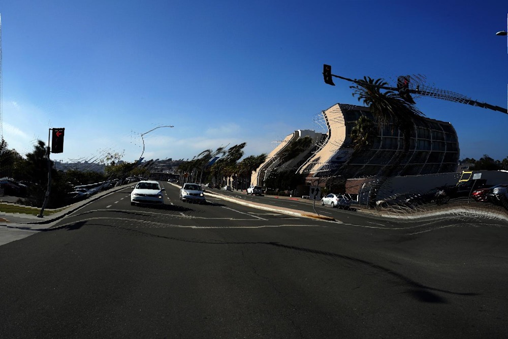
Eventually, those bitsy things take over the entire image, which is sort of ugly.
The algorithm involves inputting the initial pressure (that red/green map) and then solving for an equilibrium solution or potential. You can do this with finite differences but that is really really really slow. Instead I used a convolution with the scipy.signal.convolution function. It’s a bit tricky to figure out the reference frame for the convolution, but once understood and implemented correctly it’s blazingly fast.
I then find the gradient of that potential. Again, scipy.signal.convolution comes to the rescue as I define the finite element for the difference and simply convolve that with the potential. This is much easier done than said. (if you want to see the math, we developed it in detail for a related problem and on google scholar)
The final issue is performing gradient descent in the image coordinate space. If you take an efficient sized step, then the integer round off when you map between the real value of the estimate and its closest integer will always skip a few pixels. Iterating this ends up with lots of additional little lines. So it is necessary to perform a smooth extension along the gradient by filling in with multiple step sizes (again easier to do than to say).